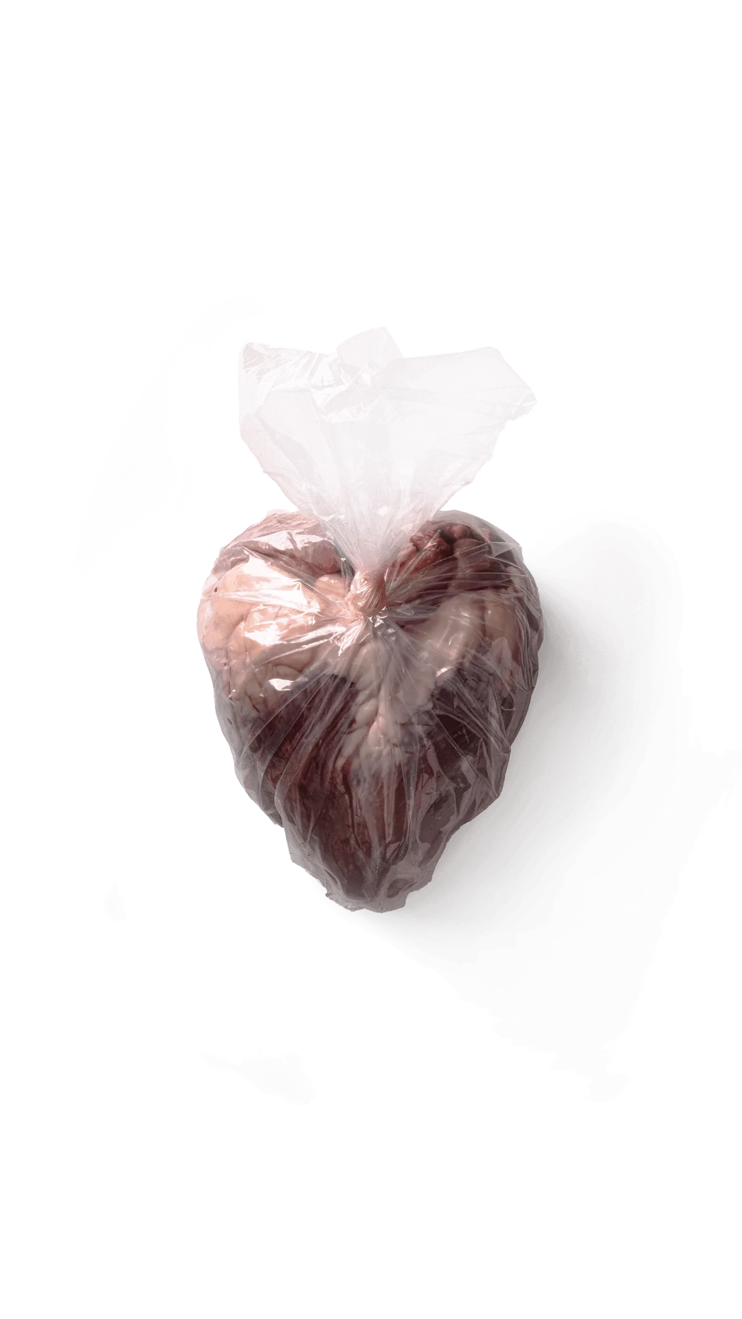
This is the photograph that opens my website. Until recently it led nowhere: it was just an image, and anyone who ran the cursor over it found nothing. This page is the place where you can finally read what's inside it.
It's called Wasted Heart and it came third at the World Food Photography Awards 2025, in the MPB Award for Innovation category. The awards were held in London on 20 May, chaired by the chef and writer Yotam Ottolenghi; thousands of photographers from more than seventy countries took part.
But the part I'm interested in telling isn't the prize. It's how I got there, which is a far less noble story than it sounds: it starts with a funeral and ends with a shopping bag.
A tribute born on the wrong day
January 2025. During the night between the 12th and the 13th the news came of the death of Oliviero Toscani. Anyone who works with images in Italy had to reckon, that day, with how much they owed him.
I had a shoot planned at a butcher's shop in my town. We decided to turn it into a tribute: to recreate Tre Cuori — White, Black, Yellow, the campaign Toscani signed for Benetton in 1996. Three identical hearts, lined up, with the names of skin colours written underneath. The meaning was simple to the point of brutality: inside, we're the same thing.
We photographed our three hearts. Then the shoot ended, and that would have been that.
The sentence that made the image
At the end of the day I asked the butcher if I could take one of the three hearts home. He picked it up and said something I've never forgotten:
"If you want, it's yours. The heart is a part that doesn't sell, compared with other parts of the animal."
Then he sealed it in a plastic bag and held it out to me.
It wasn't a joke and it wasn't cynicism: it was a market fact, spoken by someone who knows that market. There are cuts that carry a butcher's accounts and there are others that just sit there. The heart — the organ that keeps the animal alive, the one around which we've built half of our sentimental vocabulary — belongs to the second category. It gets given away.
The idea came on a kitchen table
At home I put the bag on the table and sat down to look at it. I wasn't looking for anything: the day was over.
Seen from above, the plastic stretched over the heart drew the stylised shape of a heart. Not the anatomical one I had inside the bag: the drawn one, the one in text messages and February shop windows. The two overlapped exactly, and what held them together was a shopping bag.
From there on the photograph wrote itself. There was nothing else to add: a heart, the plastic, the background. Anything more I put in would have explained something you could already see.
What the image says
This is the text the photograph was submitted with, in the original form the jury read:
A heart, symbol of life and sacrifice, wrapped in plastic like discarded goods. It evokes the Sacred Heart of Jesus, pierced and forgotten, while the animal's essence is overshadowed by more valued cuts. A silent reflection on waste, lost devotion, and the forgotten sanctity of what truly sustains us.
The reference to the Sacred Heart didn't come afterwards, as a justification. It's the iconography I grew up with: the exposed heart, outside the chest, surrounded by light. In the image that light is still there, but what surrounds the heart is a two-cent bag.
How it was made
Studio, a single light, everything else taken away.
- Camera body: Canon R5
- Lens: EF 24-70mm f/2.8 L II USM, at 53mm
- Exposure: ISO 100, f/22, 1/125s
- Light: one AD300 Pro flash, with black panels to close and shape
- Print: the exhibited image was reproduced by One Vision Imaging
Stopping down to f/22 is the choice that matters. On a small subject at close range everything had to be in focus: the plastic in front, the heart behind, the folds in between. A shallow depth of field would have turned the bag into an indistinct veil and it would have become a beautiful photograph. It had to remain a medical report.
The black panels do the opposite of what you'd imagine: they don't add light, they take it away. They close off the reflection on the plastic on three sides and leave only one alive, the one that draws the edge. It's the same method I use in chiaroscuro on dishes, applied to a subject that has nothing to do with restaurants.
Why it was a good piece for a category called «Innovation»
Competition food photography is almost always abundance: tables, colours, hands pouring. Wasted Heart does the opposite — a single object, on a neutral background, and no invitation to eat.
The most useful image I've made about food is the one where the food can't be eaten. It's something that has come in handy in commissioned work too: what decides the strength of an image isn't how full the plate is, but how clear the reason is for that photograph to exist.
Press coverage
In Italian:
- Latina Quotidiano — «World Food Photography Awards 2025: prestigioso podio per il pontino Gabriele Di Fazio»
- Fotocult — «World Food Photography Awards 2025: i vincitori»
- Latina News — «Il pontino Gabriele Di Fazio premiato ai World Food Photography Awards 2025»
The official category page is on the competition website.
A note on method, to close
I didn't construct this image. I received it: from news that arrived in the night, from a butcher who told the truth about his trade without knowing he was saying anything important, and from a badly stretched bag.
My only merit was not throwing it away.